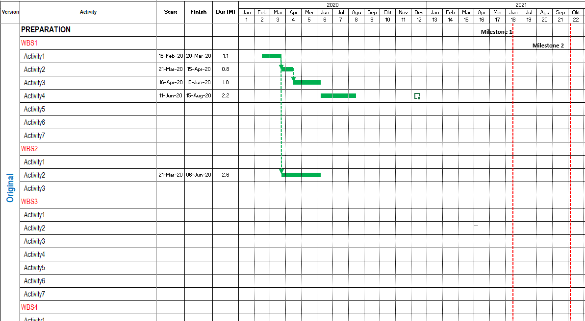
A Gantt chart is a horizontal bar chart that provides a visual representation of project activities, showcasing details such as activity names, start dates, end dates, activity durations, and interactivity relationships.
Each activity is typically represented as a bar on the chart.
In addition to the Gantt chart, there is also a Gantt table, often displayed in conjunction with the chart.
The Gantt table is a structured tabular format containing essential activity information, including activity names, start dates, end dates, and durations.
Information on the Gantt Chart
The following is an example of how a Gantt chart looks in a project’s schedule.
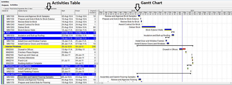
In the Gantt chart, you can display the number of activities information including:
- Activity name
- Start date
- Finish date
- Activity period (duration)
- Relationships between activities
- Critical path
- Float
- Lag and activity lead
- Milestone
- Group activities on a bottom-up or down basis.
- Overall project baseline (plan).
- Comparison of activities between planning and actual.
How to Create a Gantt Chart
Creating the Gantt chart in Spreadsheet
Before making the Gantt chart you need to make detailed activities information first.
To create a Gantt table and Gantt chart, the following are the steps:
- Create Spreadsheet columns and rows consisting of information on activities name, start date, finish date, and duration.
- You can customize the Gantt table display format as needed. For example, you want to display work break down structure (WBS) information divided by project phase, area, type of work, and so on.
- After that you need to make the Gantt chart consisting of the time interval from the project start to the end of the project. Make an spreadsheet column consisting of intervals of periods from start to finish. The interval for this period can be in months, weeks, or days. The shorter your project, the smaller the intervals to use.
- Then make the horizontal bar chart depicting the whole activities from the start to the end of the project.
- Then you can add relationships between activities.
- Determine which activities are critical and which are not.
Creating Gantt Chart in Scheduling Software
In scheduling software such as Oracle Primavera to create a Gantt chart, you only need to fill in the data in the activities table section or the Gantt table.
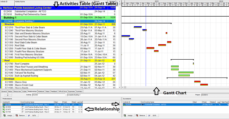
Usually, after your project is defined, you need to fill in the activities name, start date, end date, and the relationship between activities.
After the data is entered, the scheduling software will automatically display a horizontal bar chart on the right side of the data table that you have entered.
In software Primavera, if you enter the relationship correctly, the critical path will automatically appear in a different color (default is red).
By using the software you can save your plan data then fill in the actual data in different columns and compare them for monitoring purposes.
The comparison between the plan and the actual is also shown on the Gantt chart.
You can also revise the plan data and add other plan data, then compare them.
The software will automatically calculate the overall duration of your project which can be seen in the activity table and on the Gantt chart.
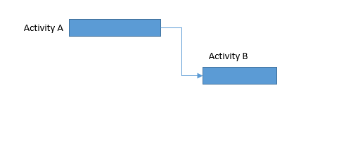
Task Dependencies in Gantt Chart
Ideally, each bar chart or Gantt chart on the project schedule should have at least one predecessor and one successor.
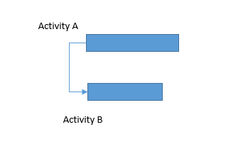
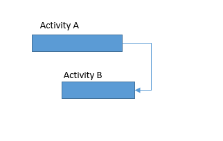
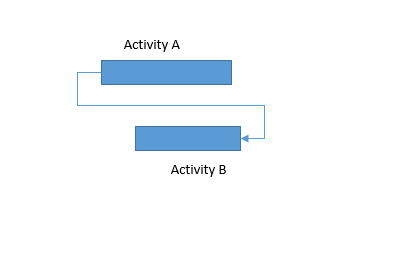
The form of dependence (relationship) between activities on the Gantt chart can be described as follows:
Finish to Start
Start to Start
Finish to Finish
Start to Finish
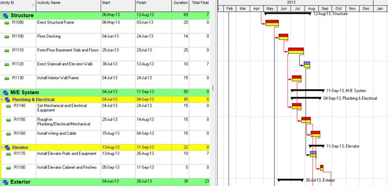
Example of Gantt Chart Implementation
The following is an example of how the project schedule Gantt chart displays (in Primavera) and its explanation:
When will you create a Gantt chart using scheduler or spreadsheet software?
The use of scheduler software such as Primavera clearly differs from Spreadsheet application’s features.
The purpose of their use is different.
From the previous explanation it can be concluded that the use of scheduling software is as follows:
- To calculate the schedule data for a project automatically. This calculation can include project duration, WBS duration (activities group), float, critical path, cost, etc.
- For planning and actual tracking purposes.
- For further analysis such as looking at the critical path, s curve, and others.
- For data storage (database) including data on activities plans, resources, and others.
- For reporting purposes.
In addition to using the software for the purposes listed above, you also need spreadsheet software to create a Gantt chart at some point.
The use of a spreadsheet is more intended to make a summary of the details of the overall activities for presentation or reporting purposes with a design according to your needs.
Suppose you want to create a presentation material with a customized appearance; then you can highlight what activities you want to display, etc.

My work experience includes roles as Project Control, Planner, Scheduler, and more. My responsibilities include fulfilling project manager needs in multinational companies by analyzing and presenting project feasibility related to planning (master schedule), monitoring and coordinating project schedules/progress, conducting delay analysis (EoT - Extension of Time), and mitigation analysis.
- Mengatur Time Periods di Primavera P6 Agar Durasi Proyek Akurat - March 14, 2026
- Cara Memilih Teknik Delay Analysis yang Tepat dalam Proyek - March 14, 2026
- Standar Work Breakdown Structure (WBS) pada Proyek Konstruksi - March 14, 2026


